KiwiDX
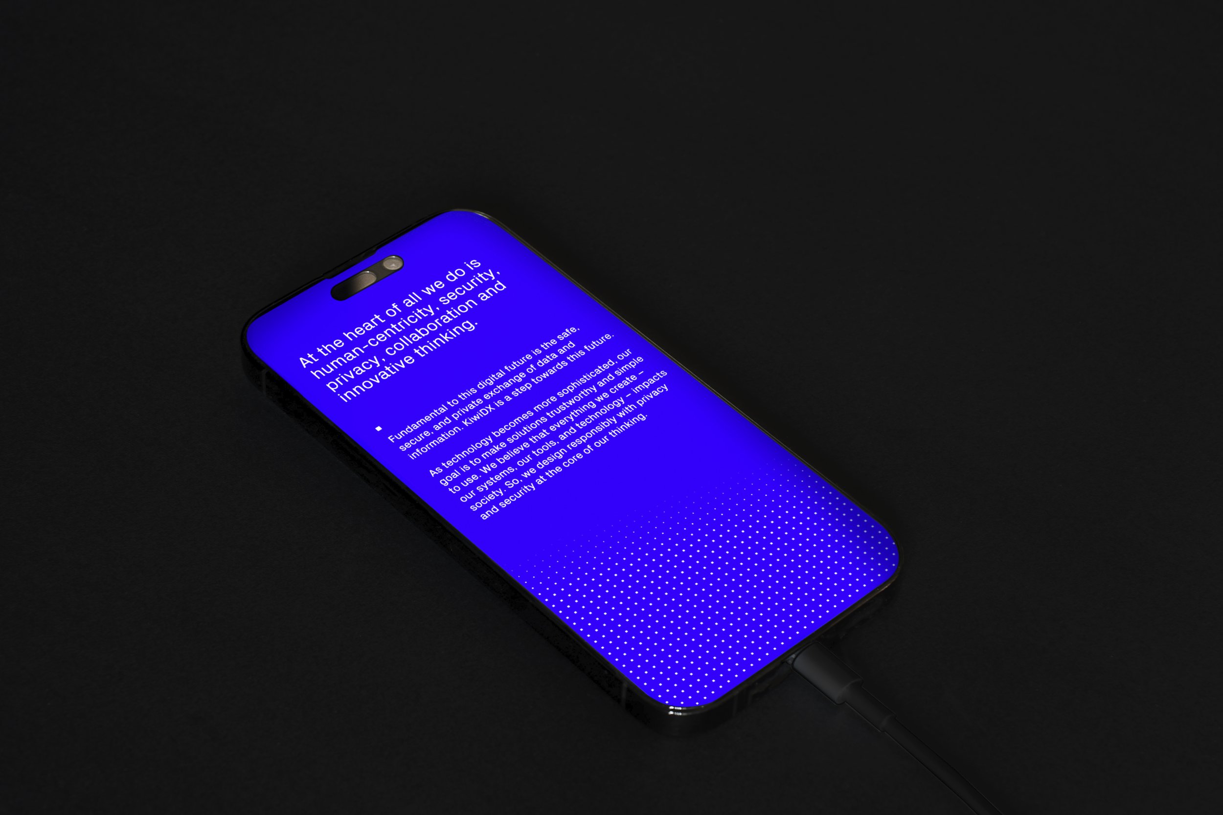
KiwiDX is a secure digital information exchange solution. As more of the world’s activities shift online, the need for data privacy and security has become increasingly paramount. Our mission was to craft a brand identity that tells a story of secure and intuitive file transfer.
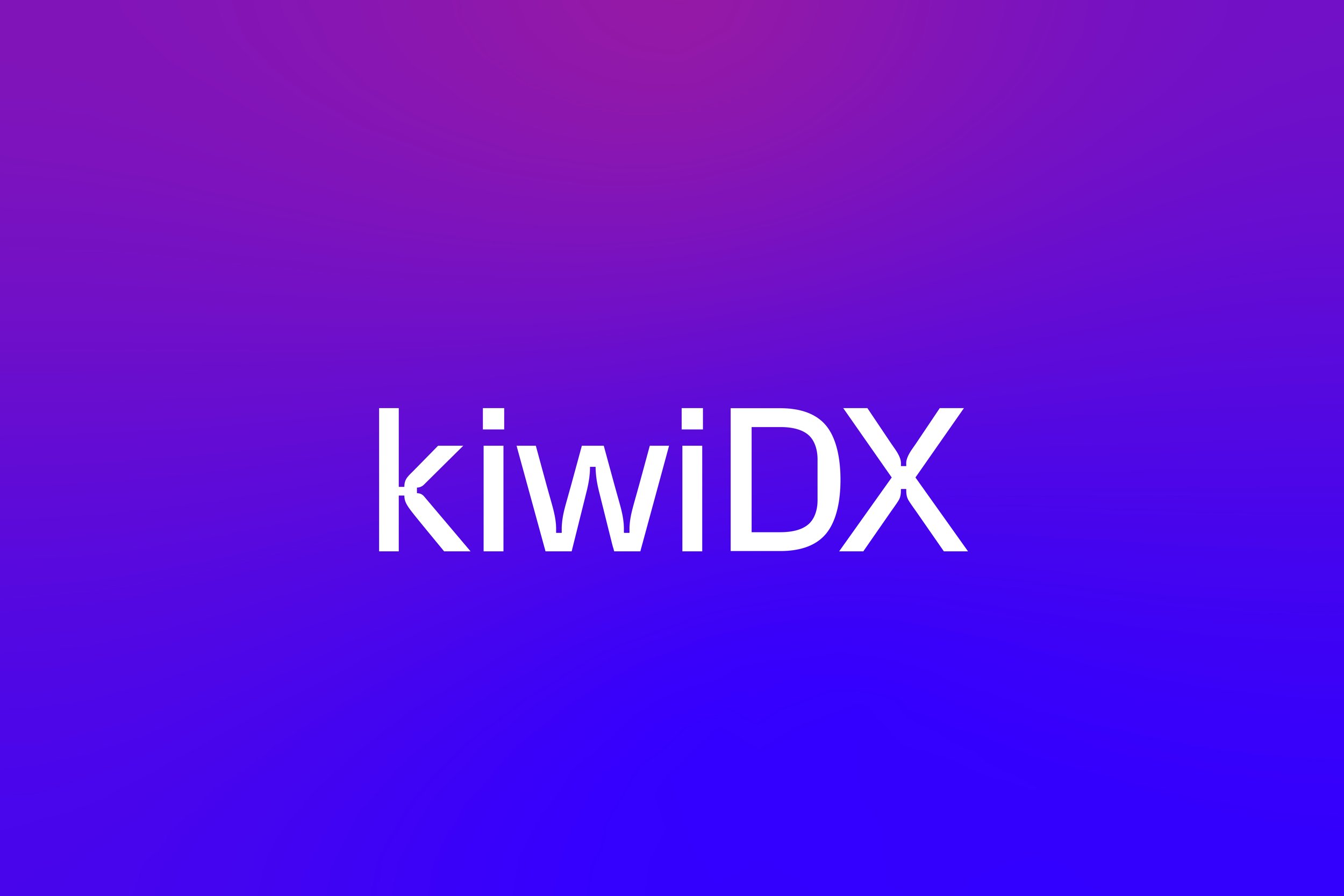
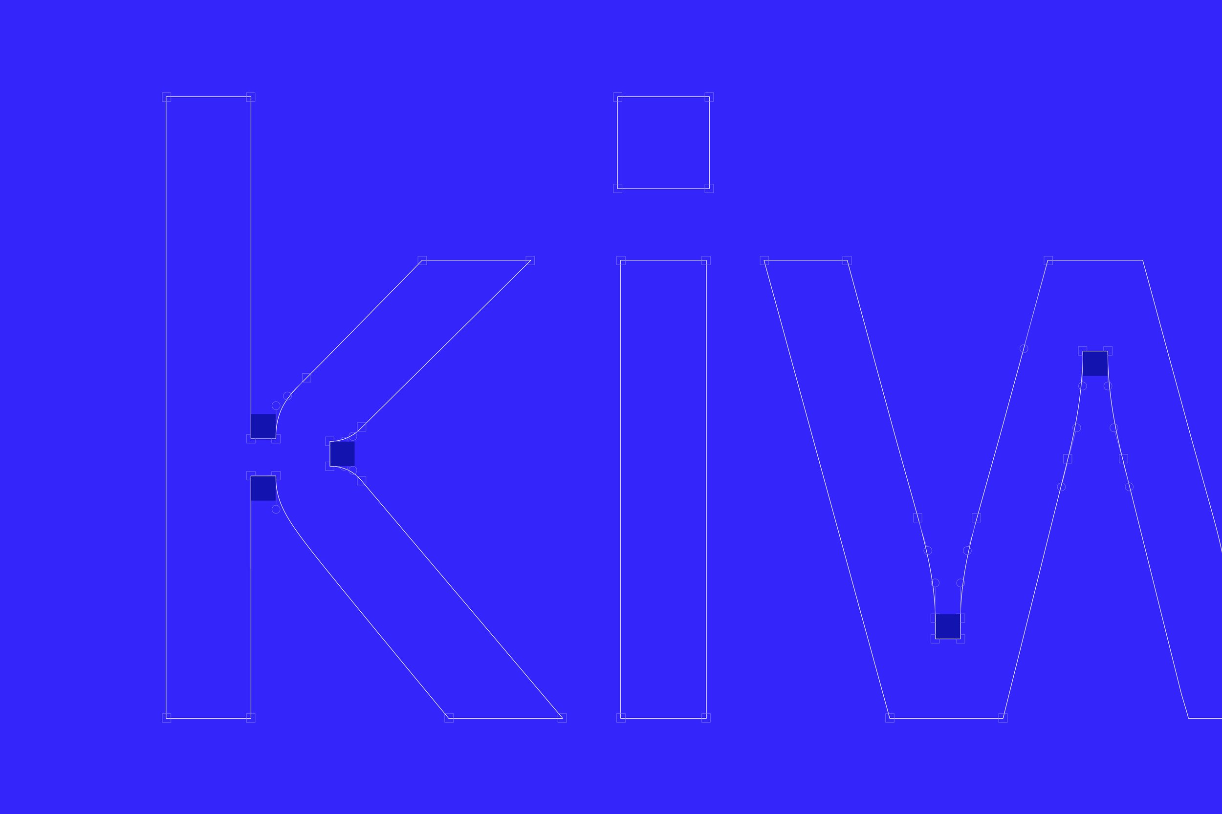
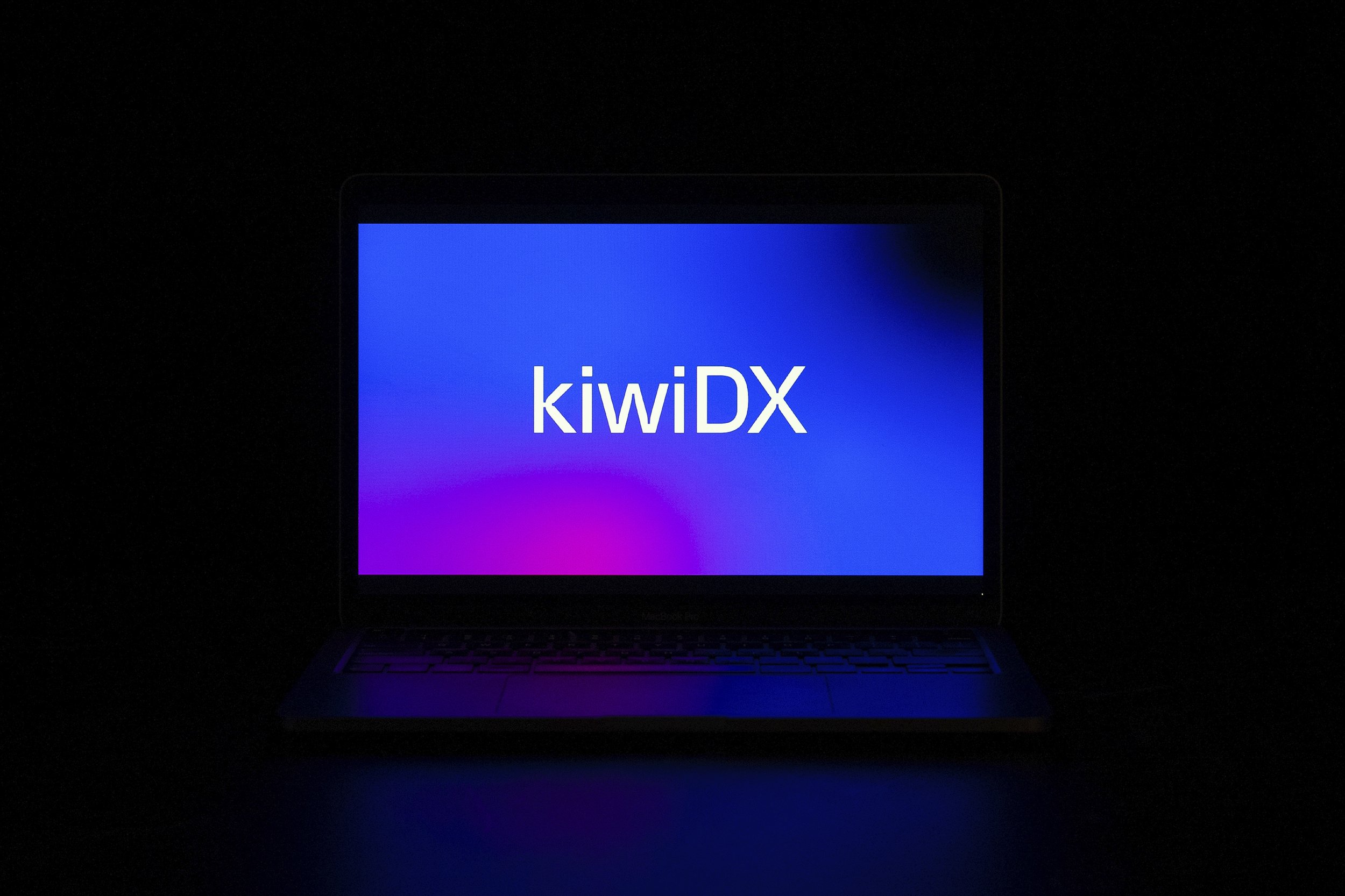
Drawing inspiration from the pixel, KiwiDX’s visual identity takes shape. The bespoke logotype incorporates pixels into the letter joints, resulting in an inktrap-esque typeface for the digital age. The brand typeface ‘PX Grotesk’ was selected for its pixel-inspired angular forms, giving the brand a technology- and future-focused look and feel.
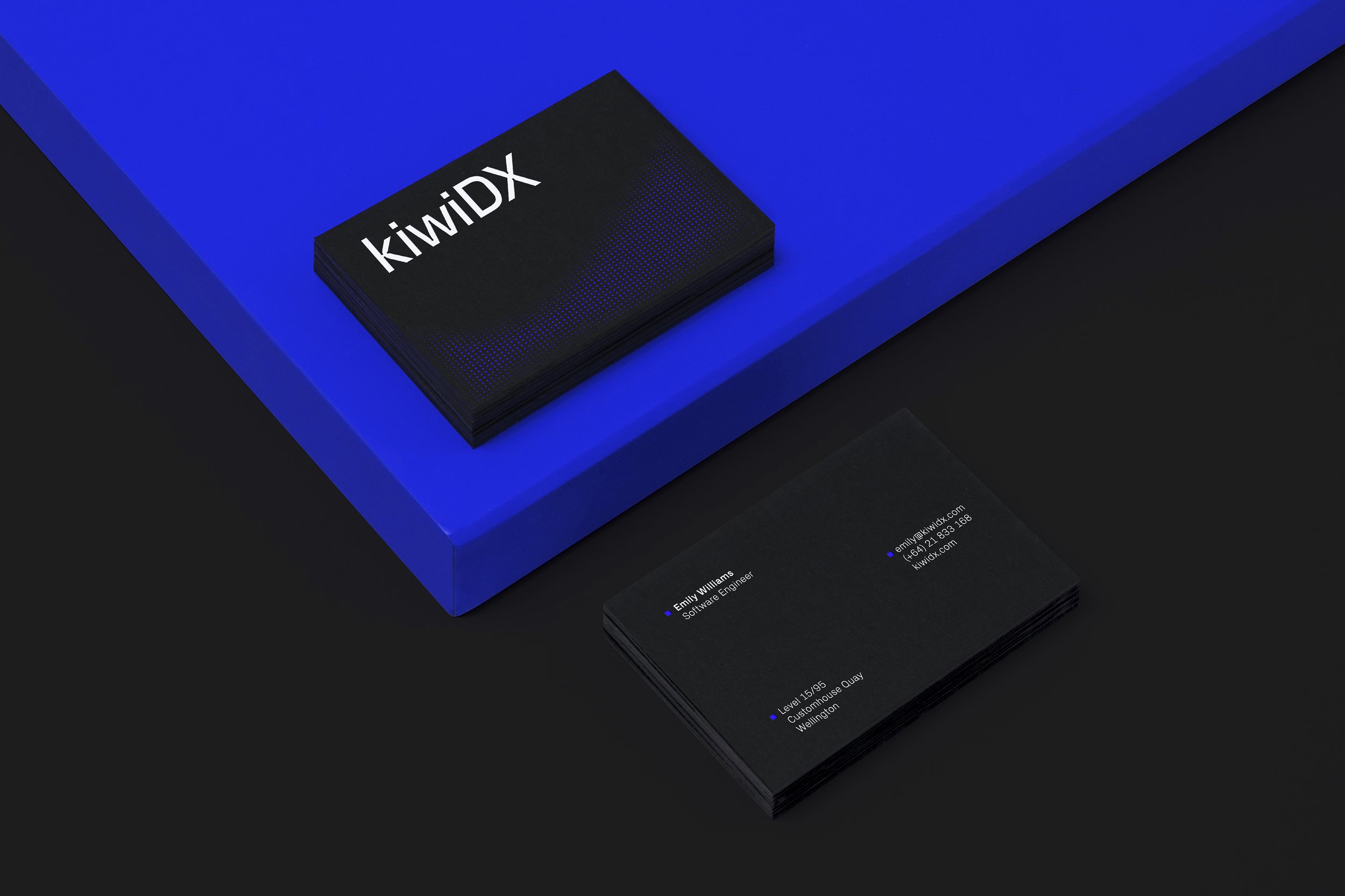
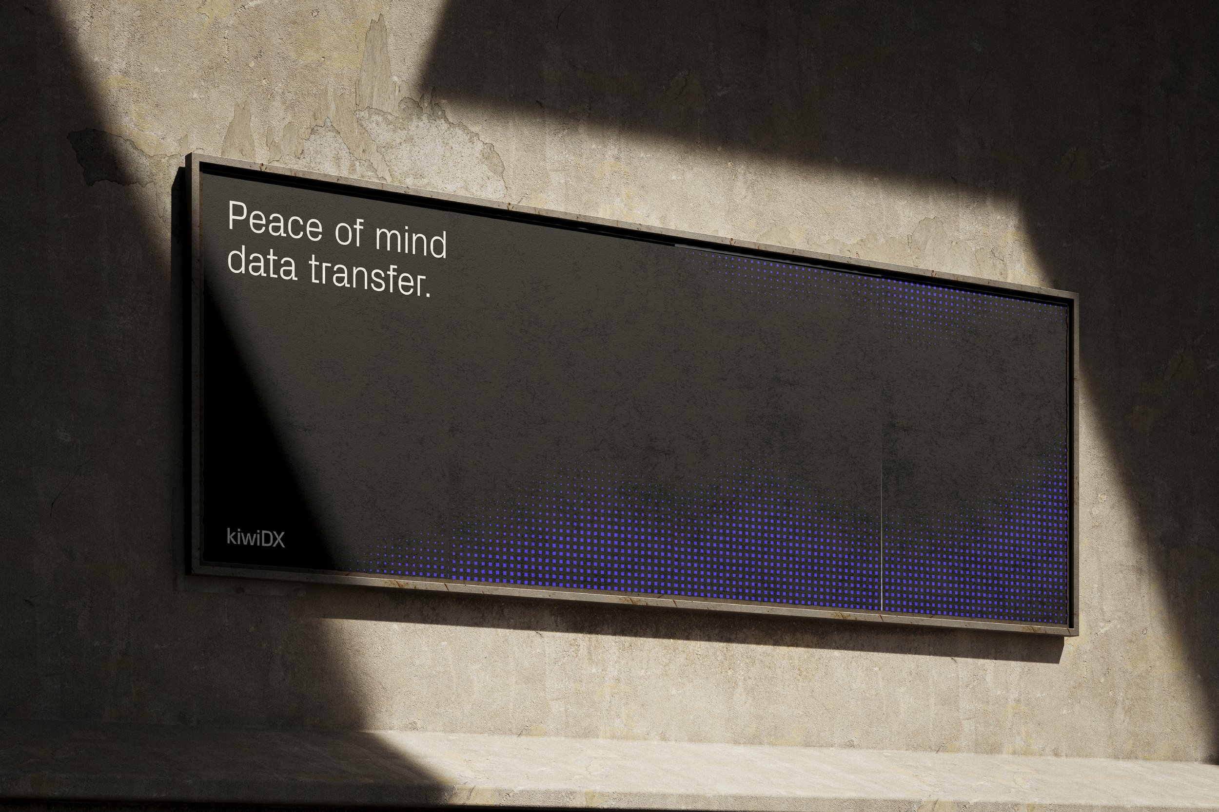
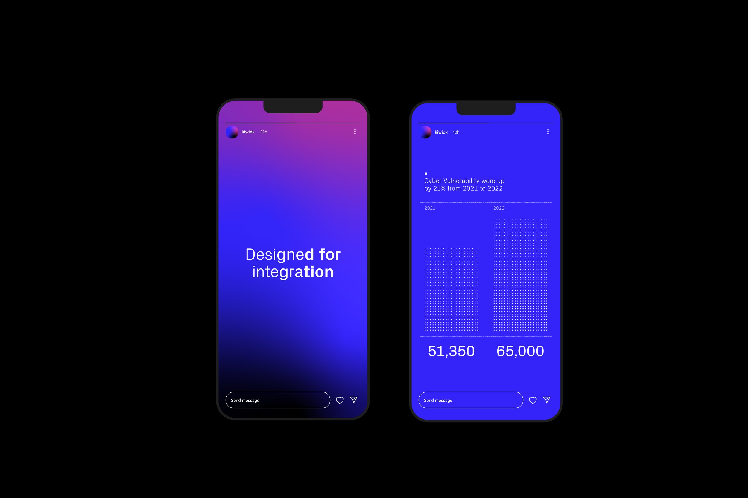
The essence of KiwiDX extends beyond the pixel. We envisioned a brand pattern that reflects the graceful movement of bird murmurations. This visual metaphor symbolises the movement of data from one point to another, representing the brand’s commitment to secure and seamless data transfer.
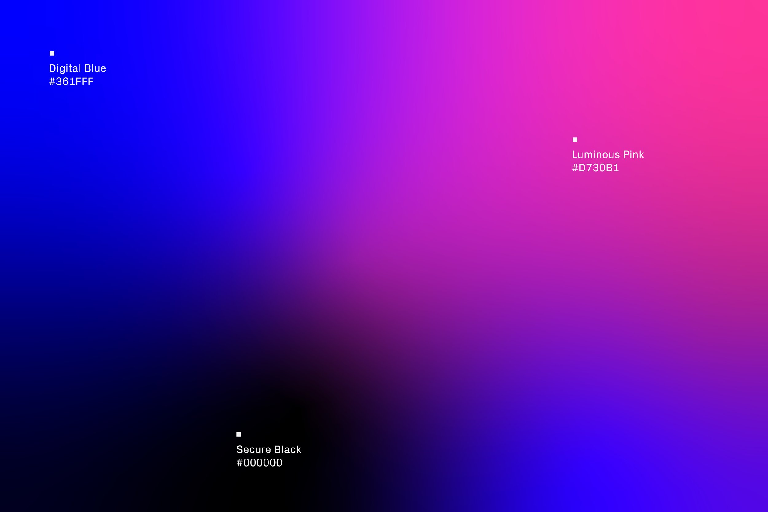
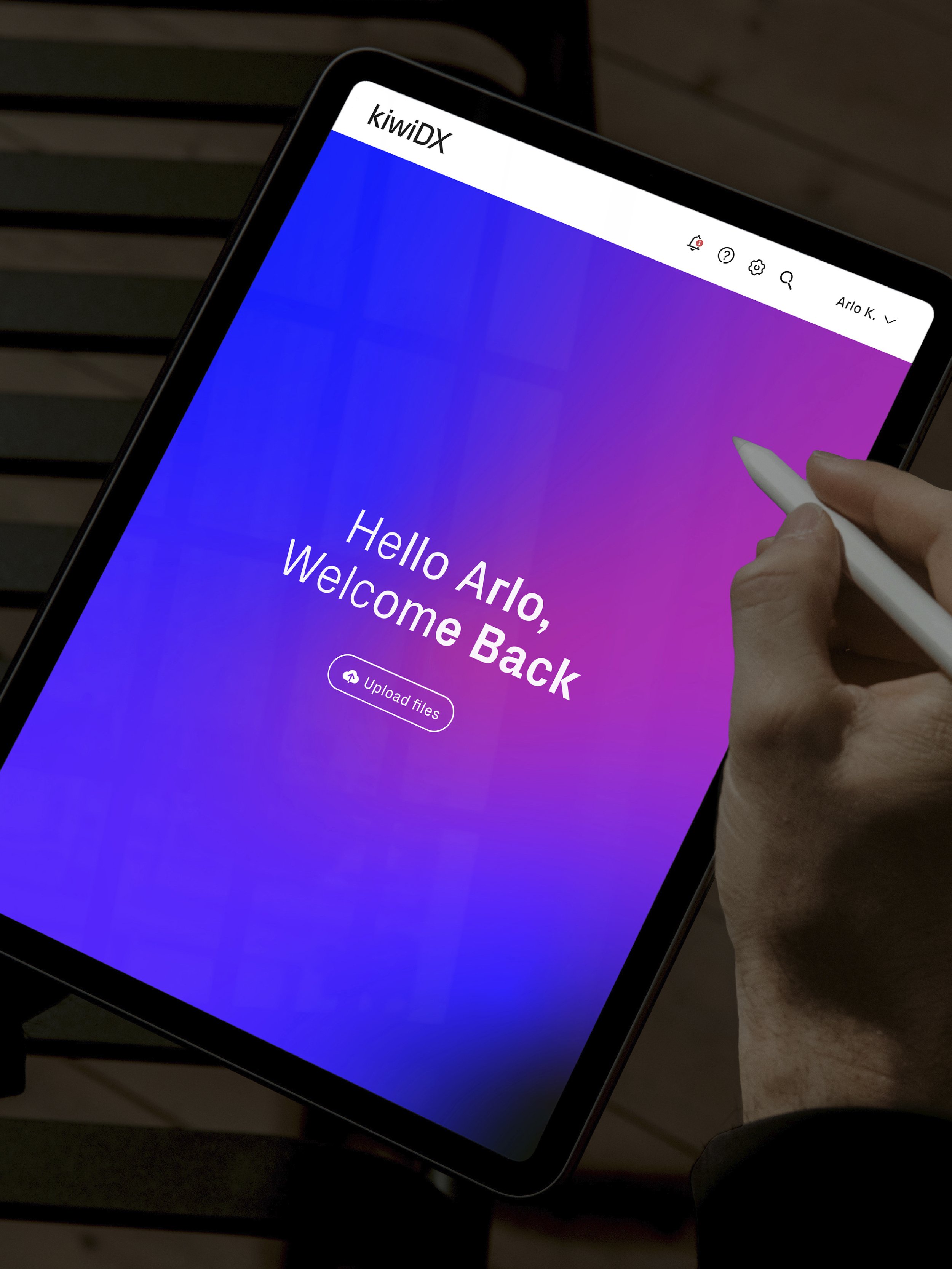
Living primarily in the digital space, KiwiDX embraces a vibrant RGB colour palette that breathes life into the brand’s identity. These energetic hues, blended through gradients, evoke a feeling of seamlessness and flexibility, mirroring the product’s capabilities.
Client Todd Digital
Studio Richards Partners
Team Brian Richards, Ro Chen, Kyle Ranudo, Tommy Chin
Specialties Brand Identity