The Village Square
The Village Square Trust is a not-for-profit community services provider based in Parnell with a 30-year history in bringing people together. Previously named The Parnell Trust, we were asked to refresh their brand, including a rename and an overhaul of their visual identity.
The client indicated that they needed a name change due to the stigma that the suburb of Parnell carries, stunting their ability to branch out. Meanwhile, their old visual identity was dated and lacked consistency, didn’t reflect the heart of what they do, and ultimately diluted the strength of their brand in the community.
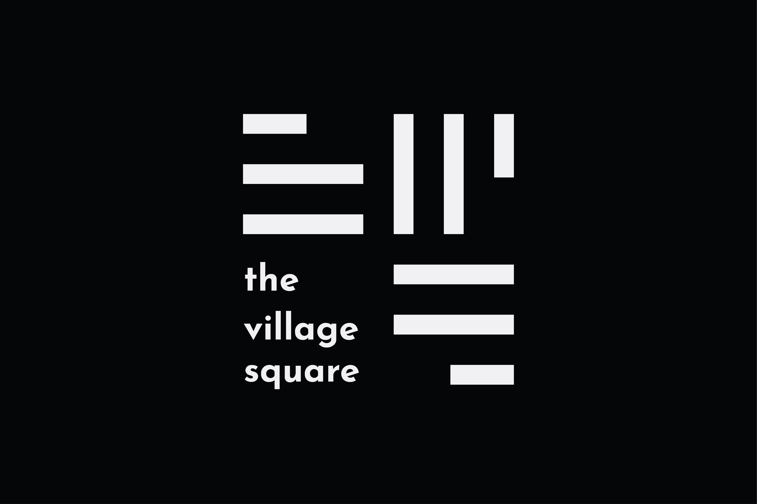
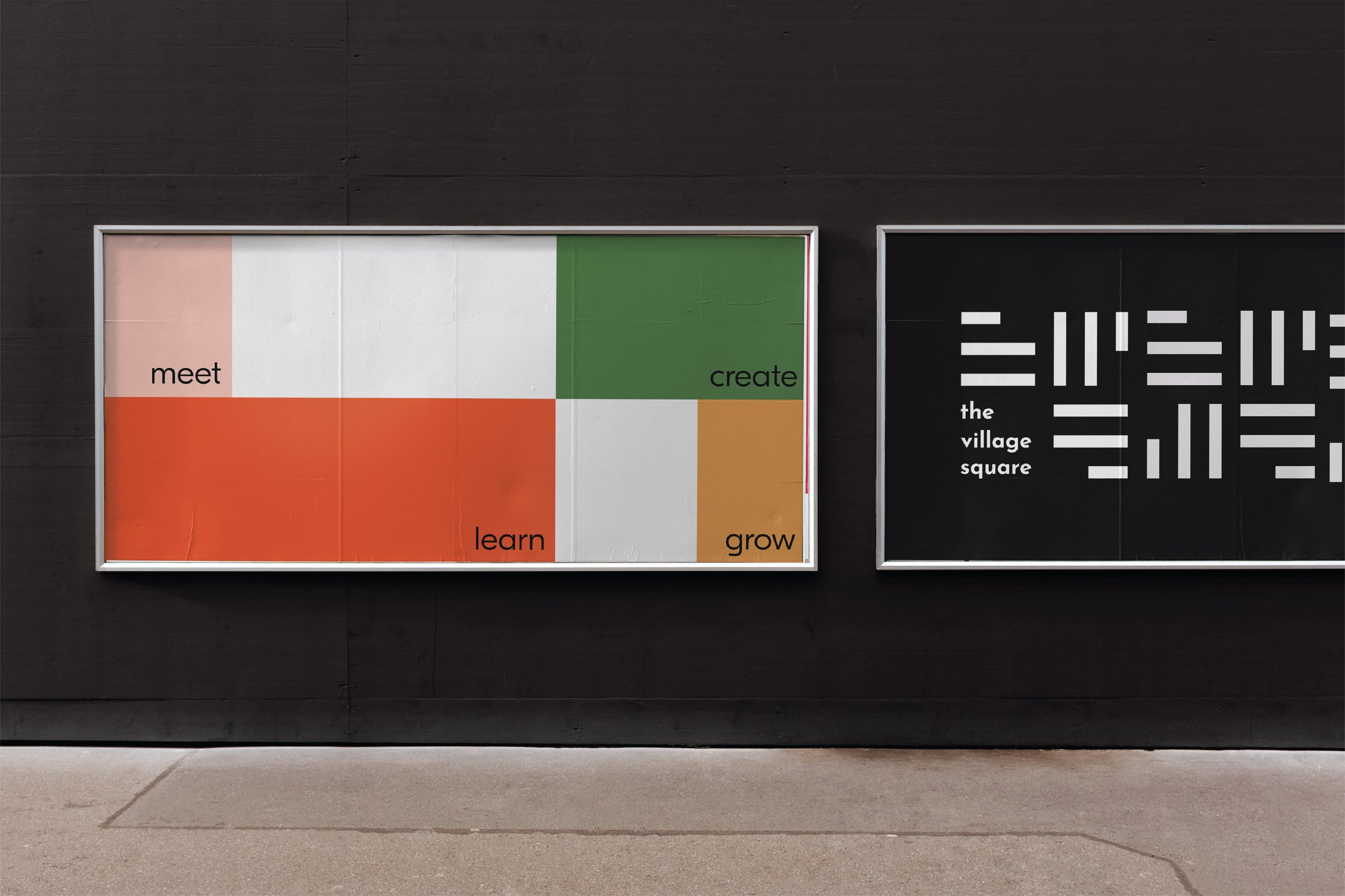
Their new name, The Village Square, is inspired by the space that has traditionally been found in the centre of towns; used for community gatherings. A town square has always been the beating heart of a community, where all walks of life intersect in a shared space that promotes exchange, discourse, and trade.
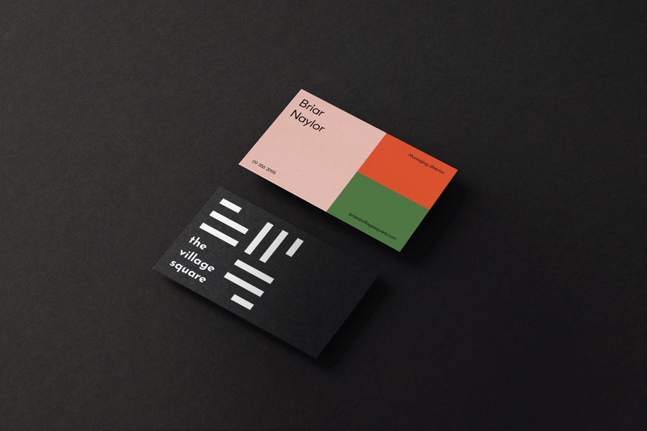
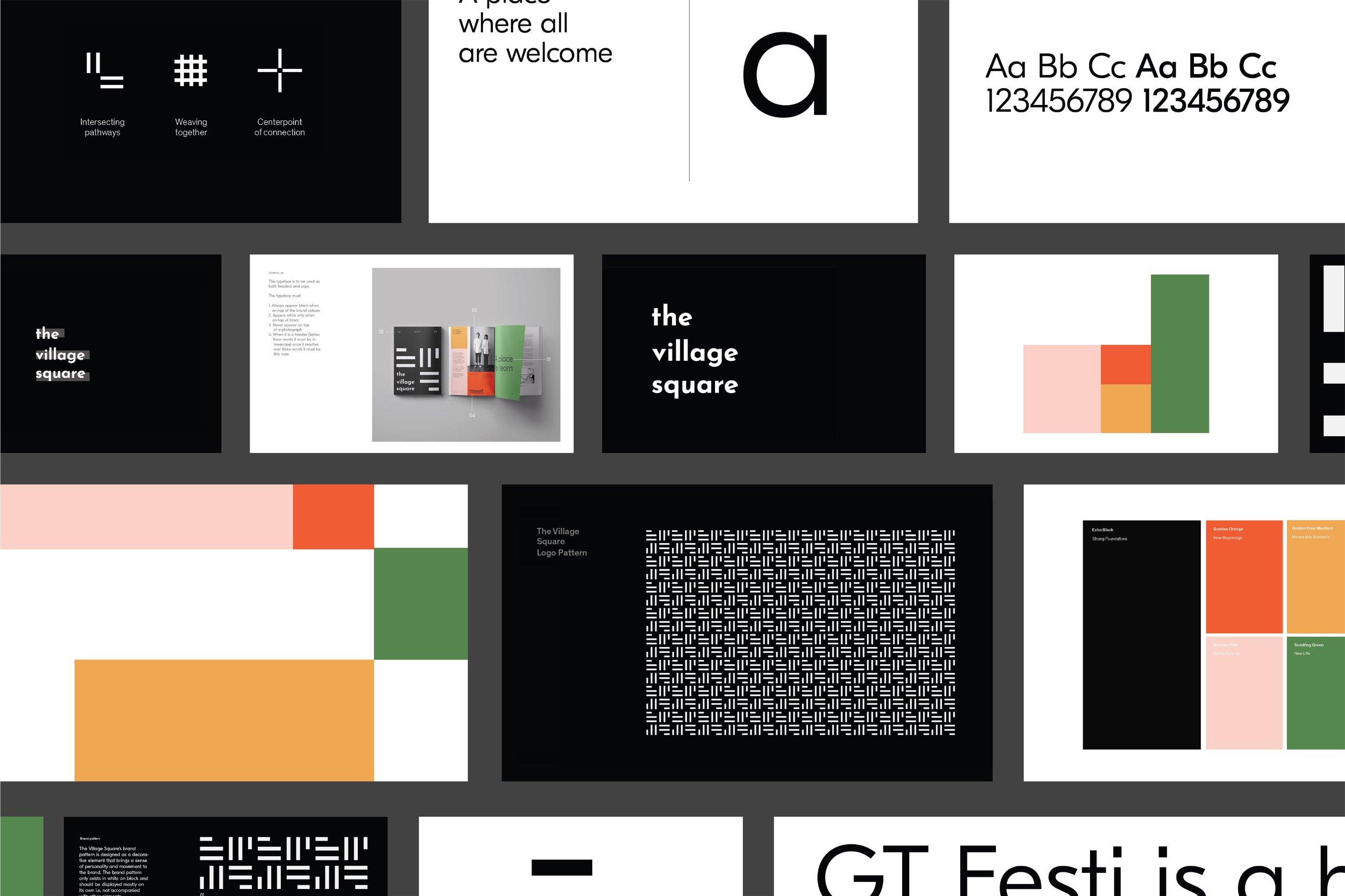
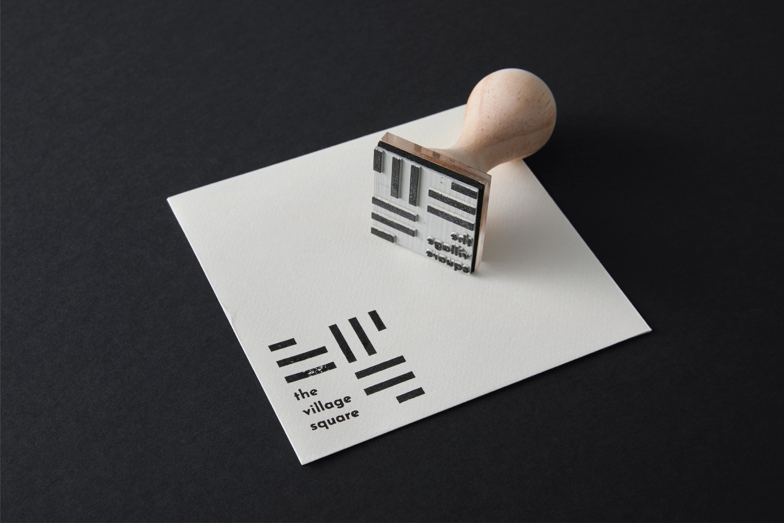
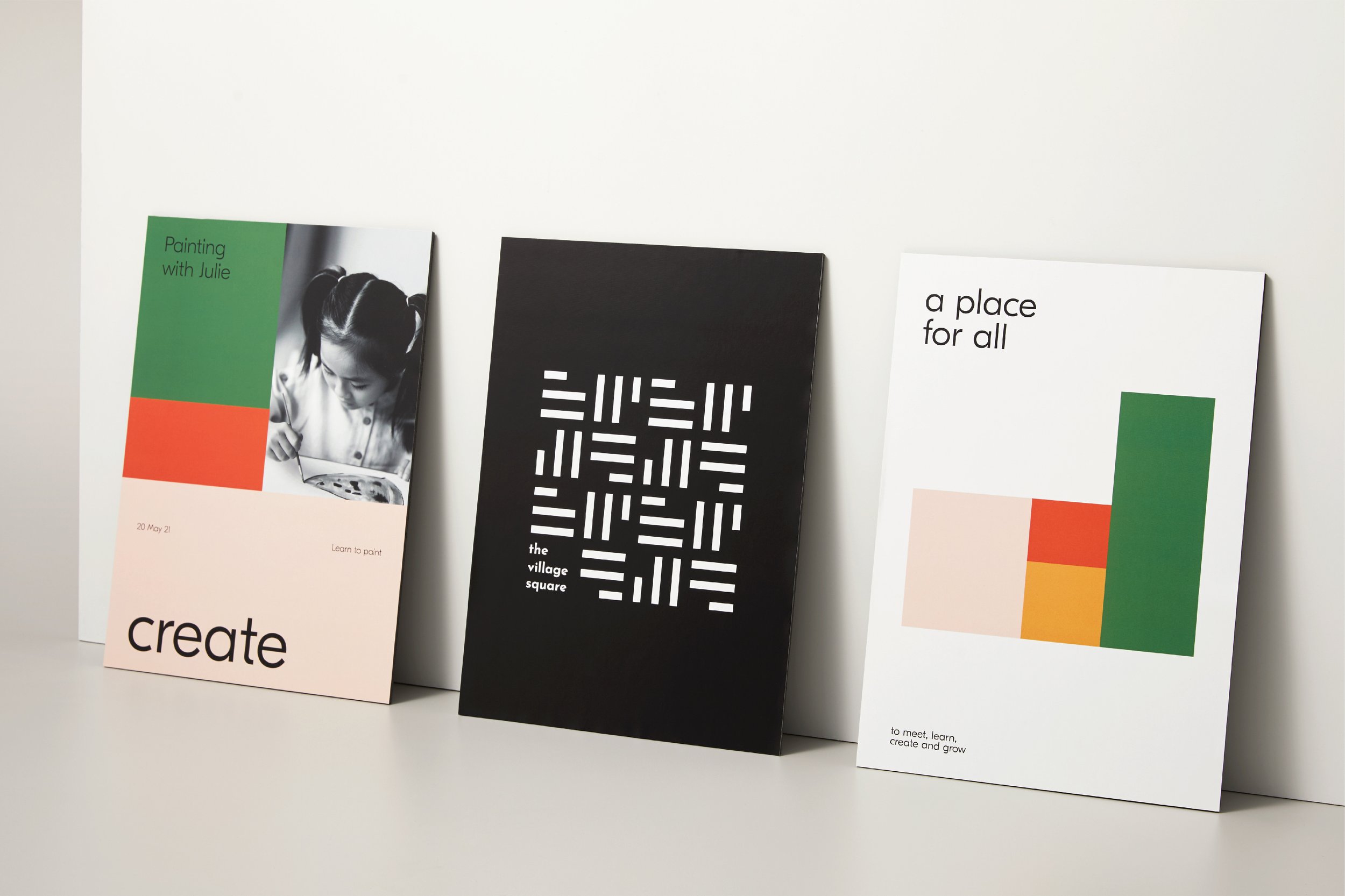
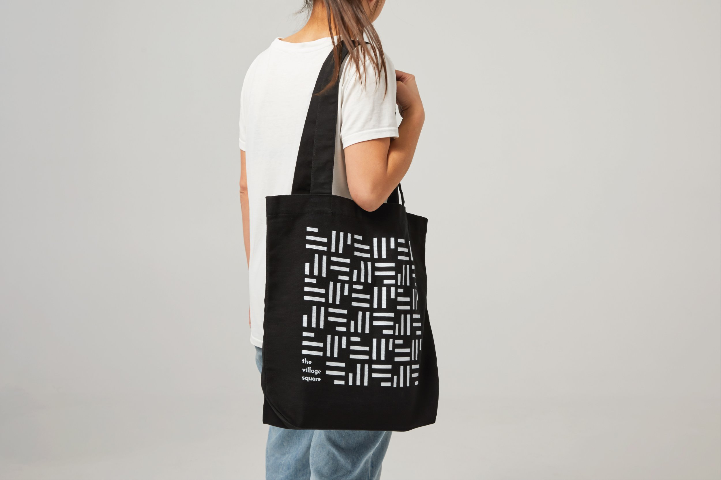
We crafted the visual identity to articulate the parts of the sum that make the whole. The brand logo is built with squares, with pathways to guide the eye towards the centre. The logo embodies three central guiding concepts; the interconnection of pathways, the centre point of connection, and the weaving together of communities. Further investigating the metaphor of a village square, the brand’s grid systems are constructed from squares, giving the brand identity a distinctive approach to the layout of collateral.
The end result is a new name and visual identity that articulates a celebration of spirit and life, community and togetherness. It signals the true scope of The Village Square’s work and ambitions, going beyond just the suburb of Parnell to invite people of all walks and ages to be a part of the fabric of the community.
Client The Village Square Trust
Studio Richards Partners
Team Brian Richards, Brya Taylor, Scott Wallace
Specialties Brand Strategy, Brand Identity