Amaia of Takapuna
A mixed-use property development with the potential to combine the best of urban, suburban and coastal living, our client challenged us to create an appealing name and brand identity for their new project on 48 Esmonde Road, Takapuna.
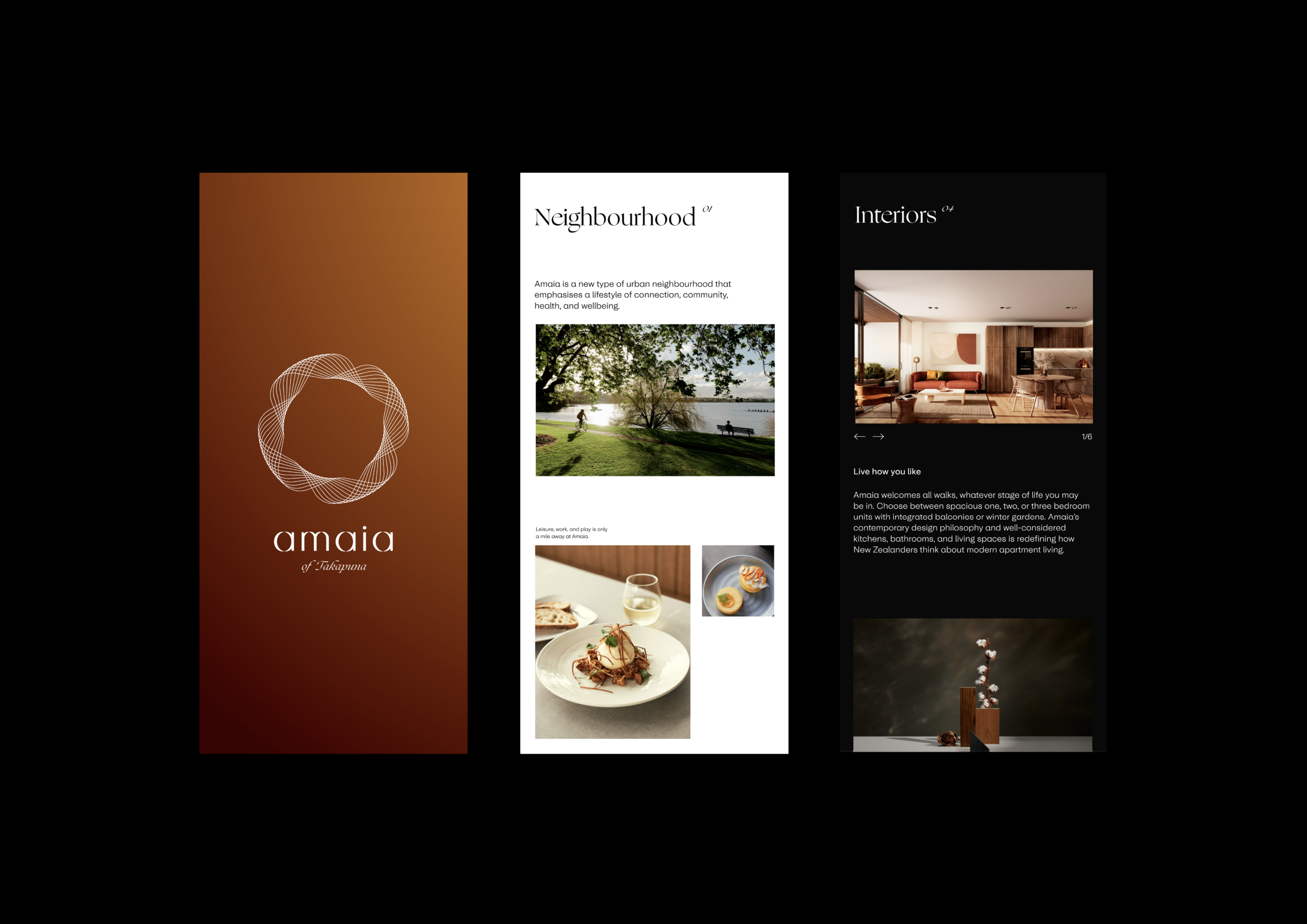
We set out to design an identity that’s more a lifestyle-brand than it is a property-brand. Amaia, which means lunar rainbow in Māori, is both a nod to the aspiring interculturalism of Auckland, and the shape of the isthmus on which the development sits.
After being involved in the strategy, naming, and positioning of this project, a lot of pressure to bring the ideas to life rested on our shoulders when it came to the design phase.
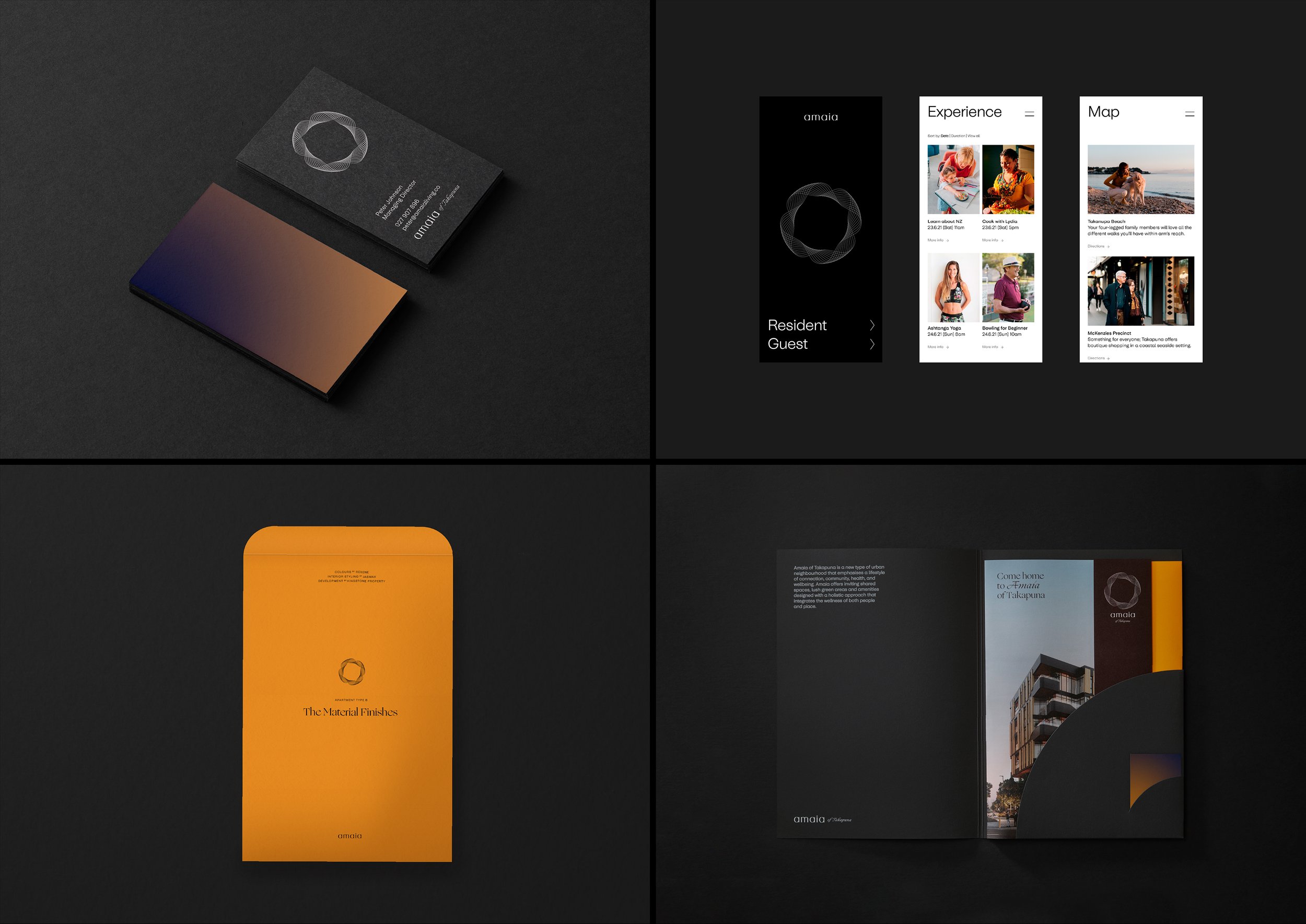
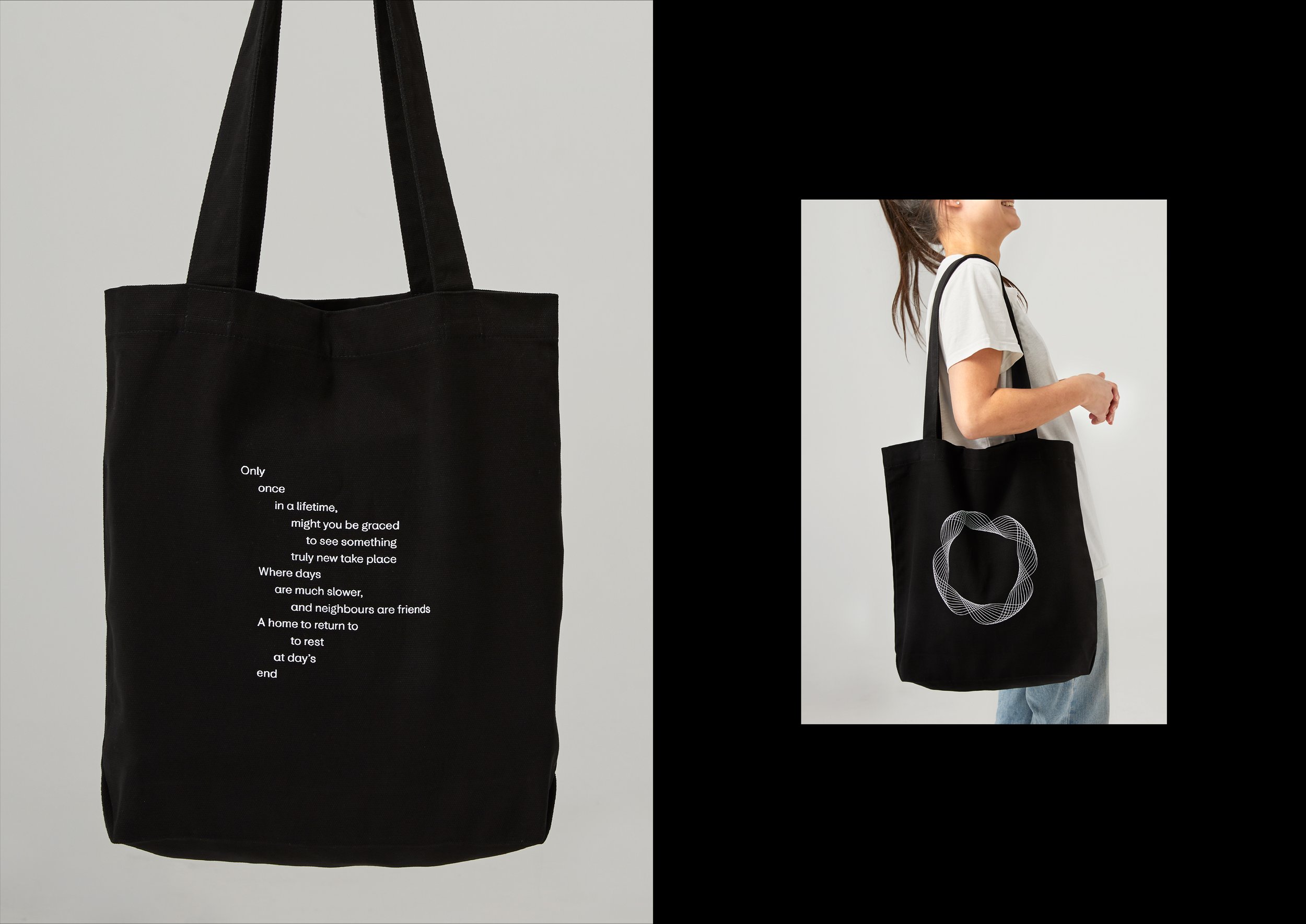
My process began with finding the best solution to represent Amaia through a logo symbol. The final result was drawn with a spirograph, one of the many tools I carry around with me to get off the computer and onto the drawing pad when the occasion calls. This symbol echoes the shape of a lunar rainbow, and the (once) island which Amaia sits on. The Amaia wordmark is also inspired by Amaia’s lunar namesake; each letter crafted to echo the phases of the moon.
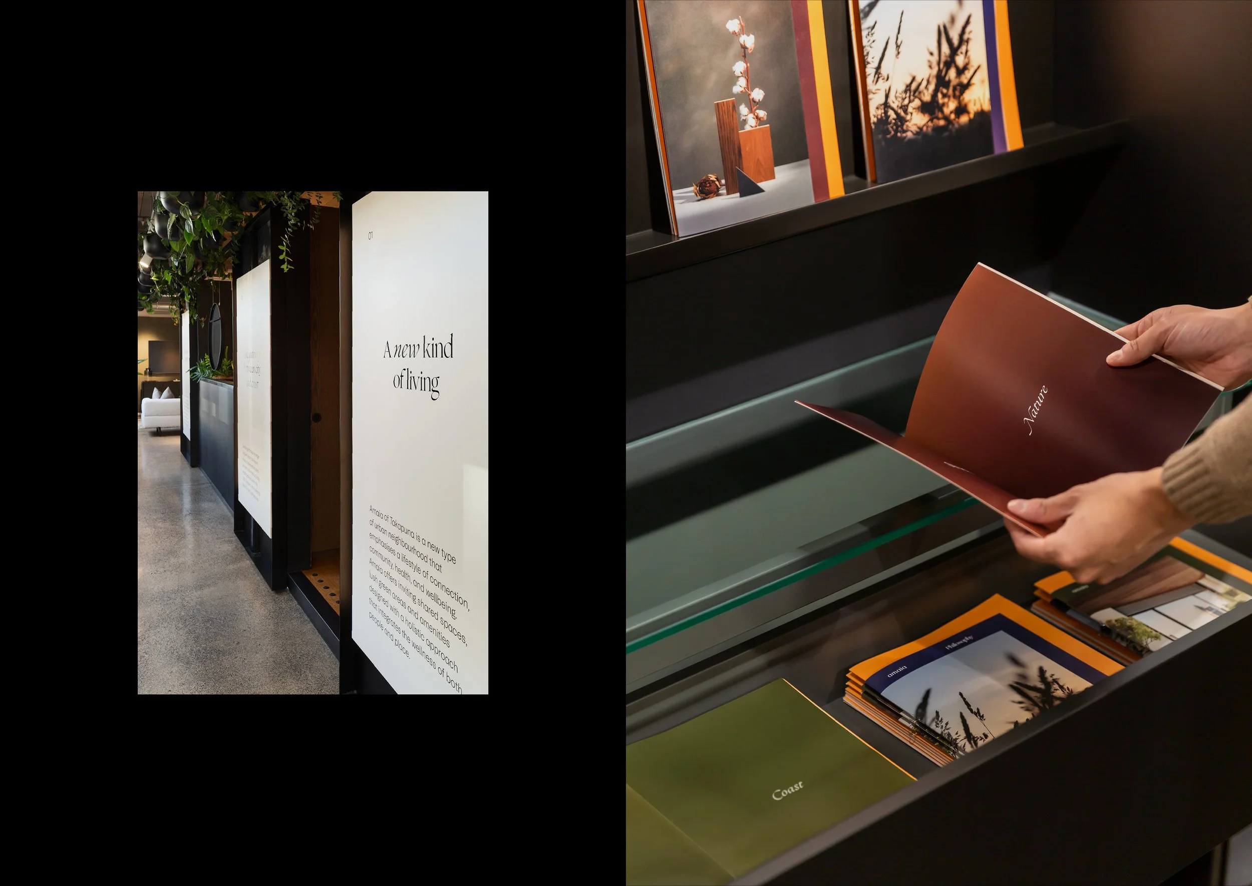
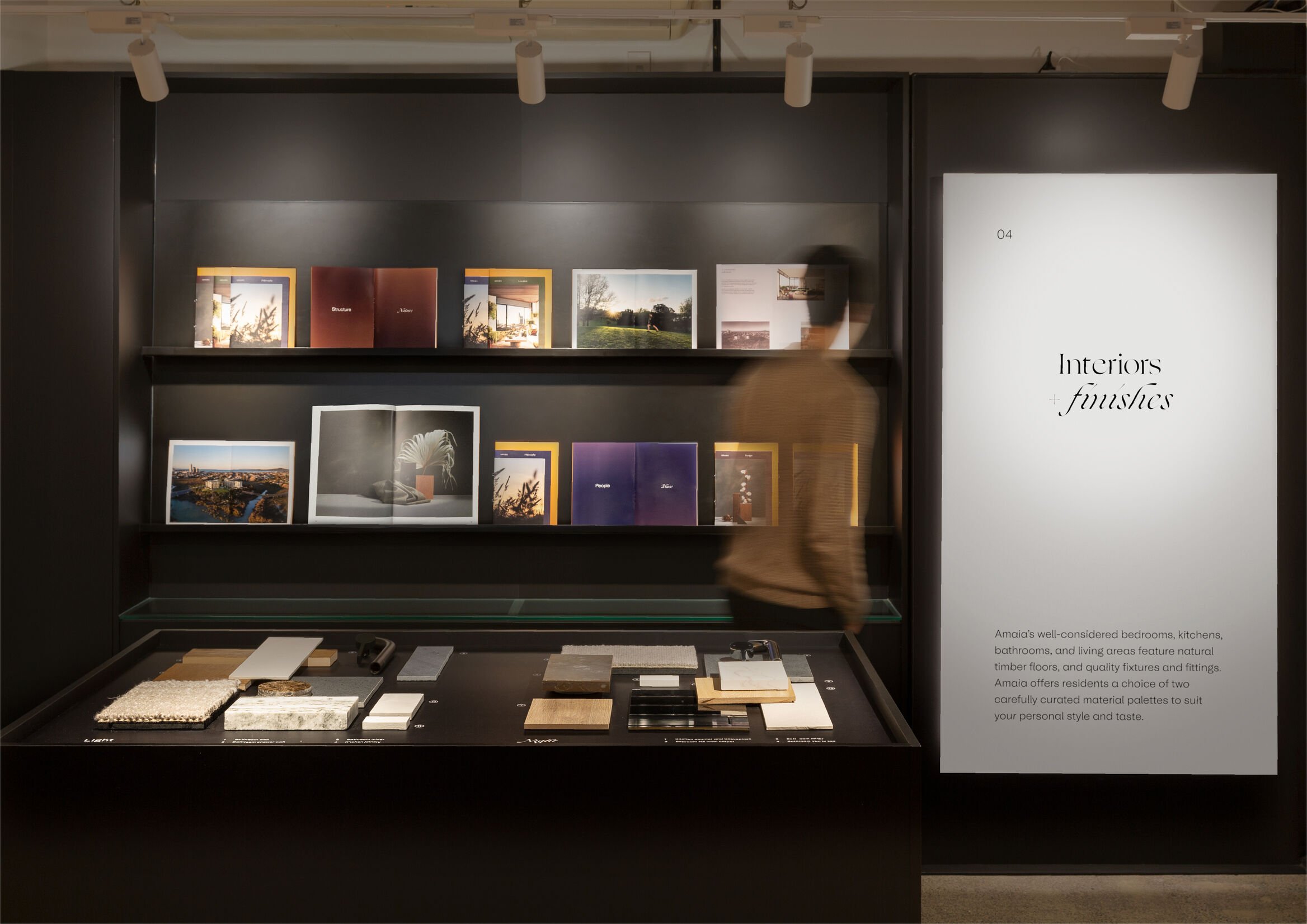
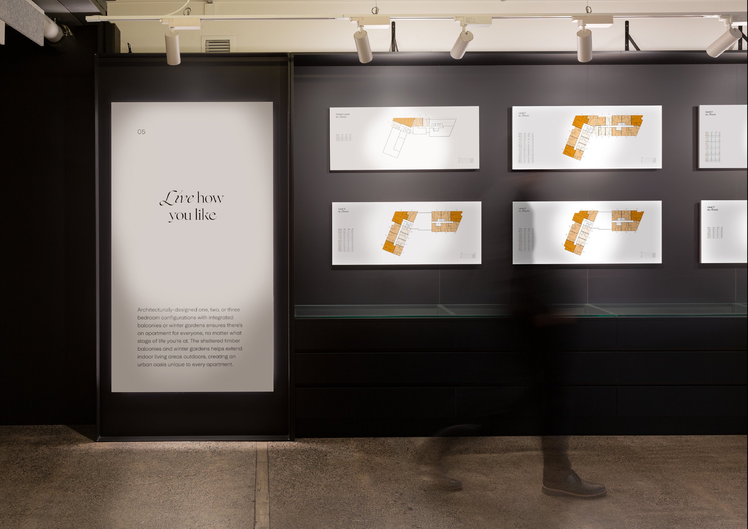
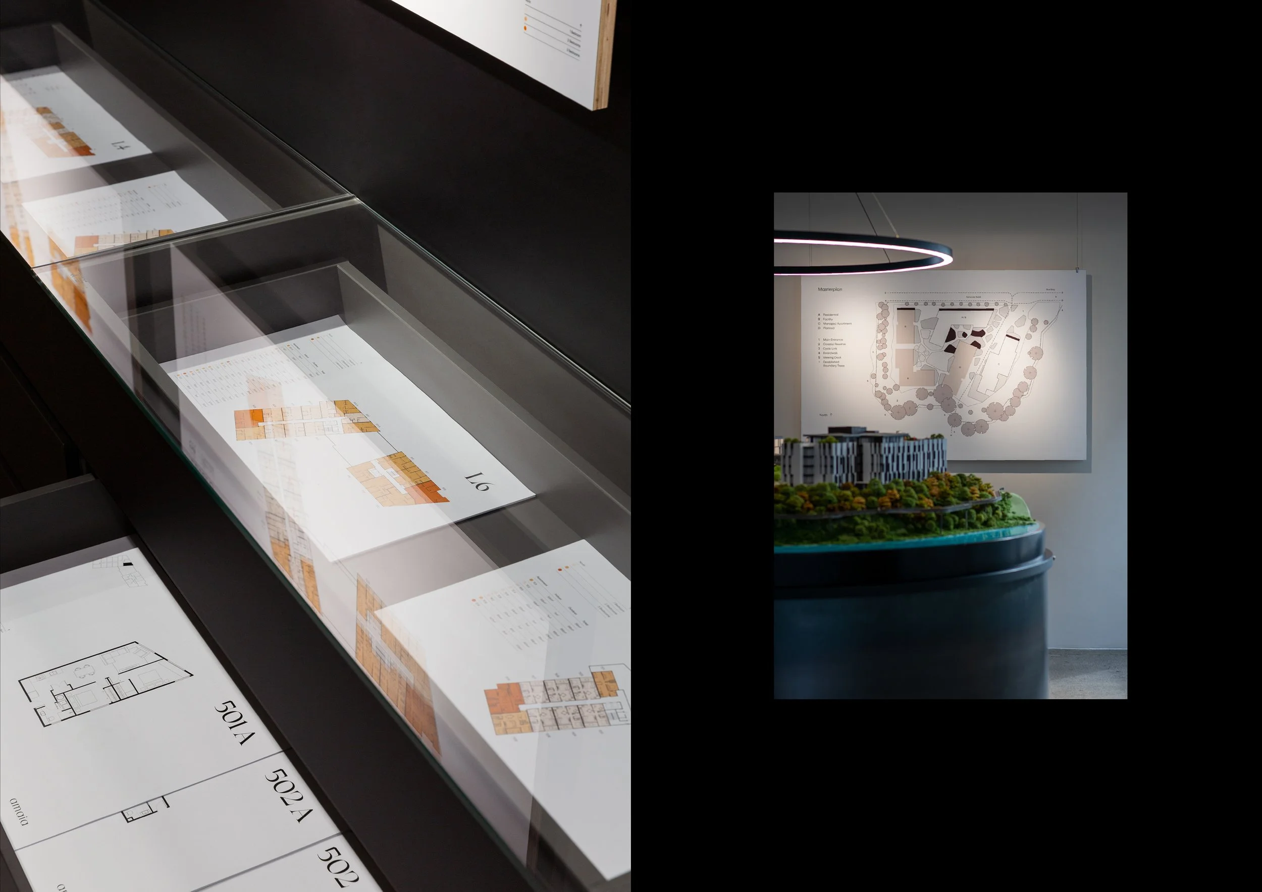
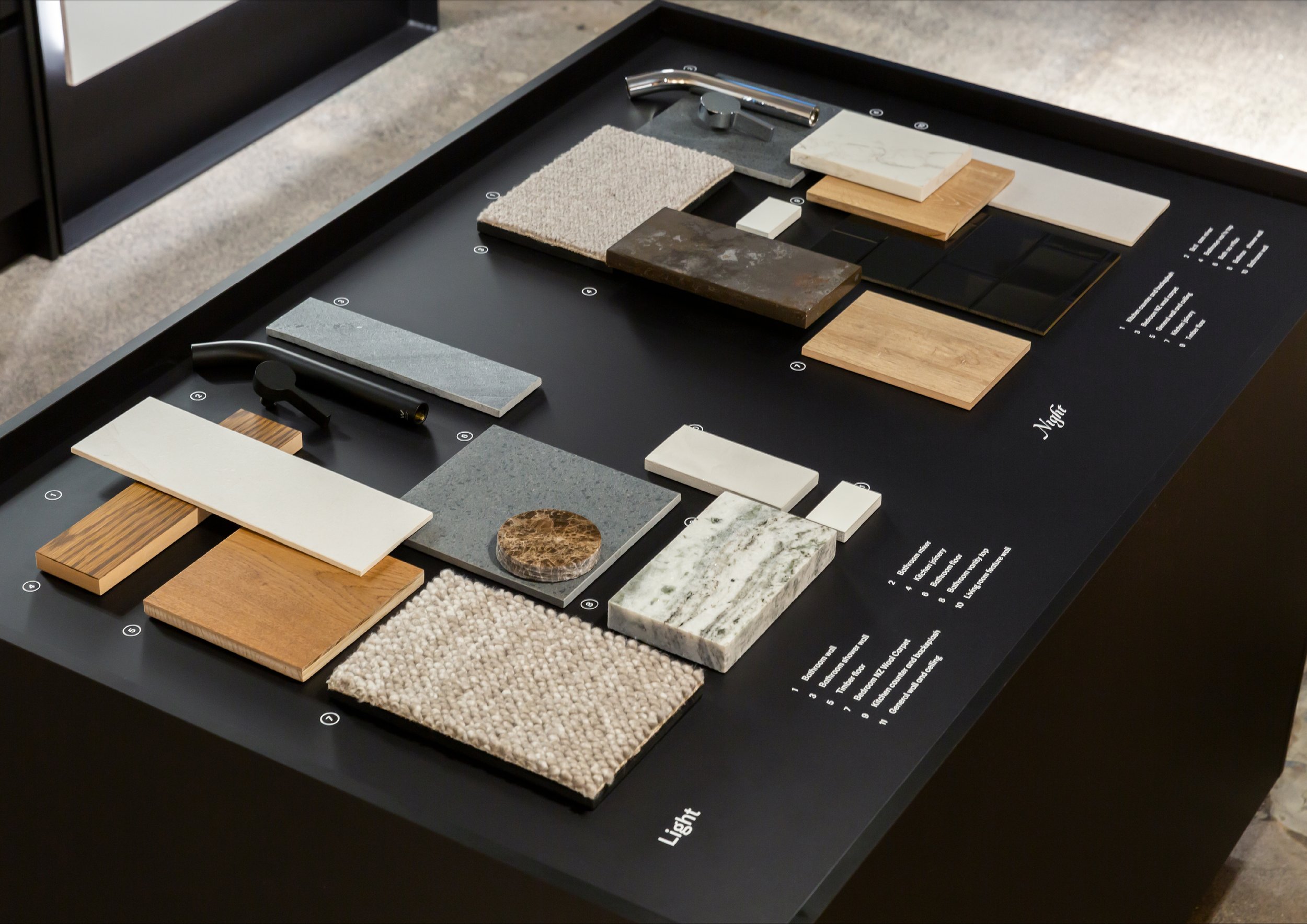
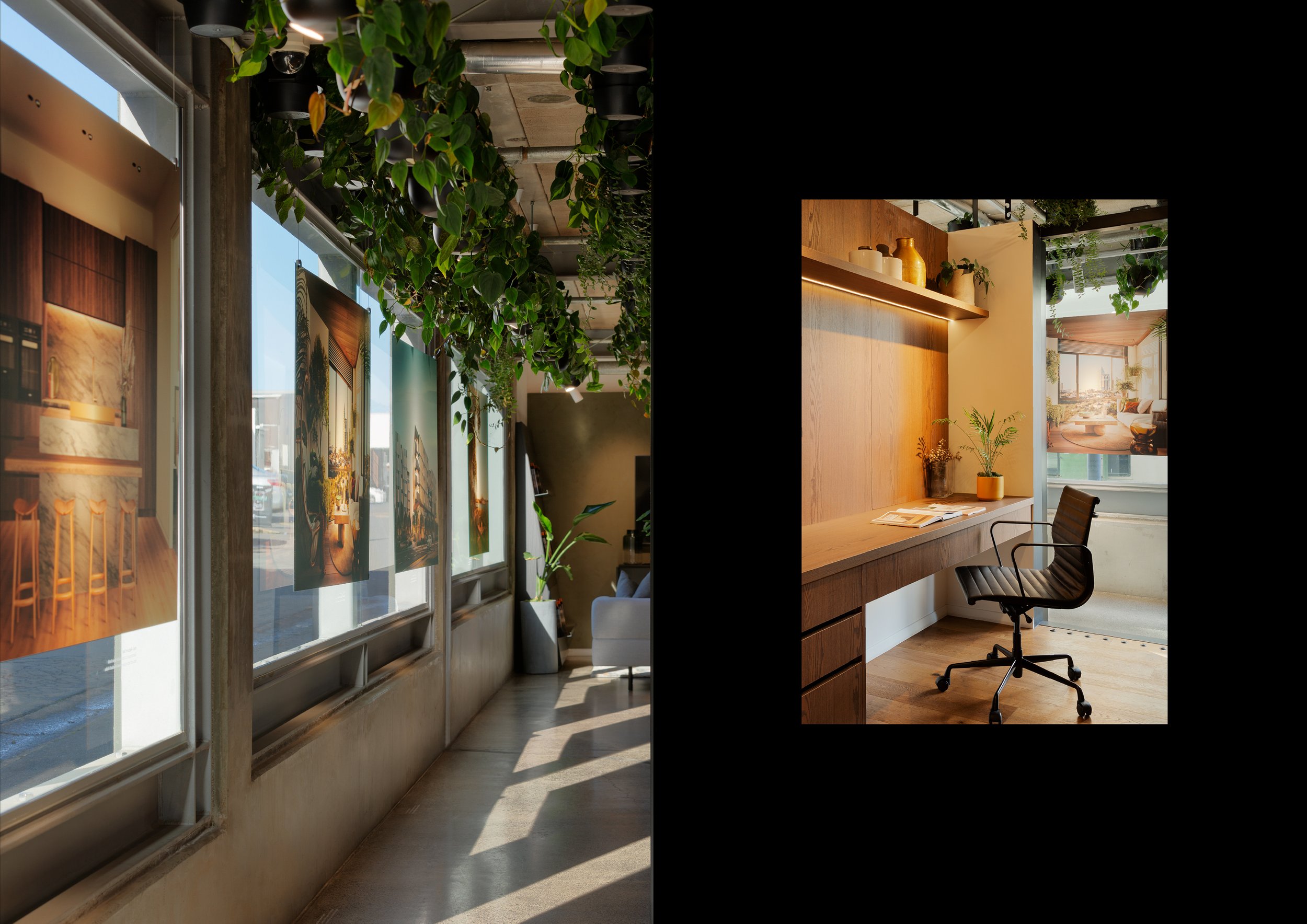
Our work on the project for Amaia involved everything from photography to helping with the physical construction of the show suite — there really wasn’t an element we didn’t have our hands on.
After going through the process of buying off plans myself, what I deeply wanted to create was a feeling for the brand that actually encapsulated a sense of the place and the home you were buying into.
Client Kingstone Property
Studio Richards Partners
Team Brian Richards, Tommy Chin, Kyle Ranudo, Brya Taylor, Ro Chen, Jinki Cambronero, Jasmax, Wildlabs
Specialties Strategy, Naming,
Brand Identity, Photography & Video Art Direction, Web Design, Print Collateral, Advertising, Environmental Design


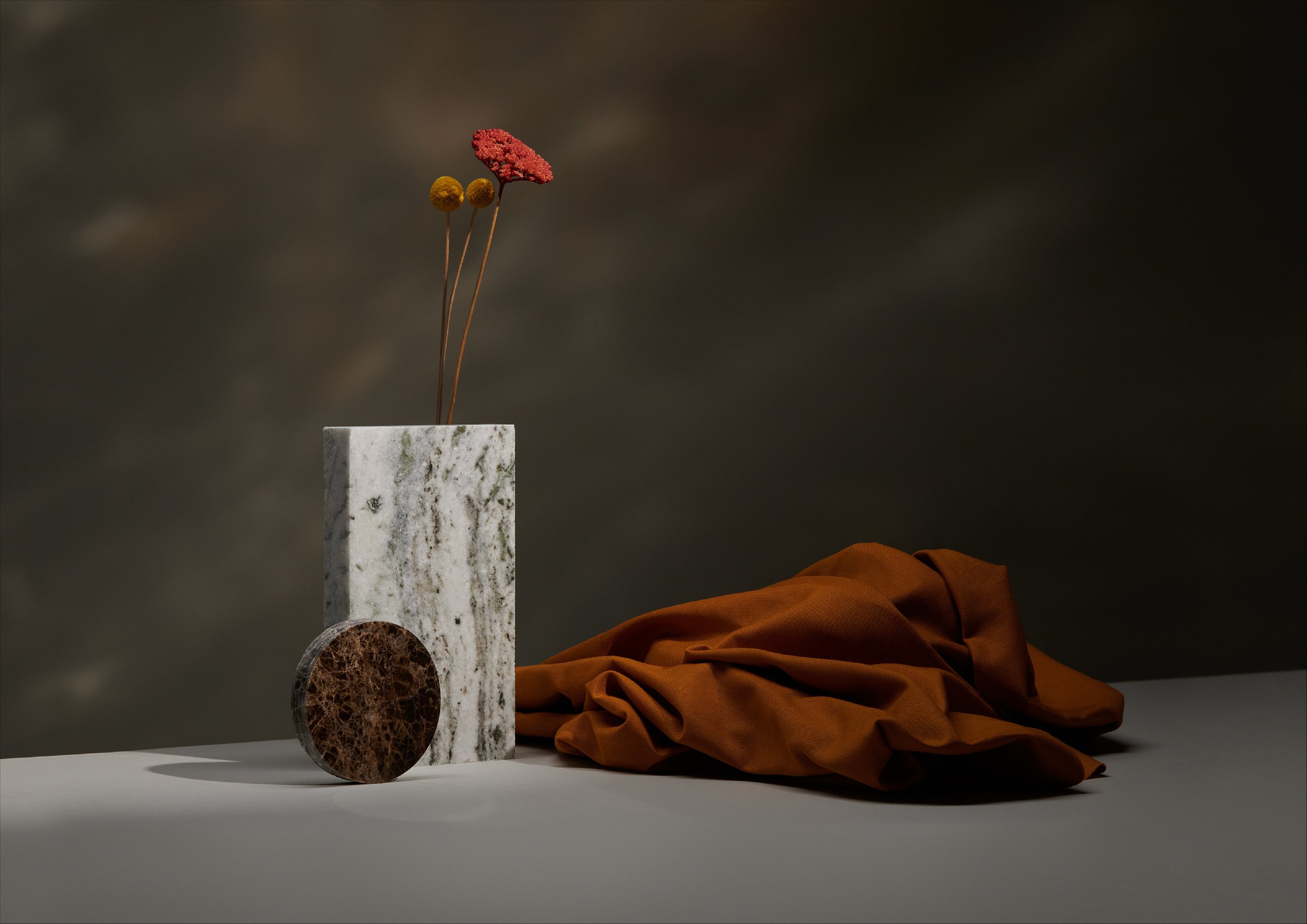


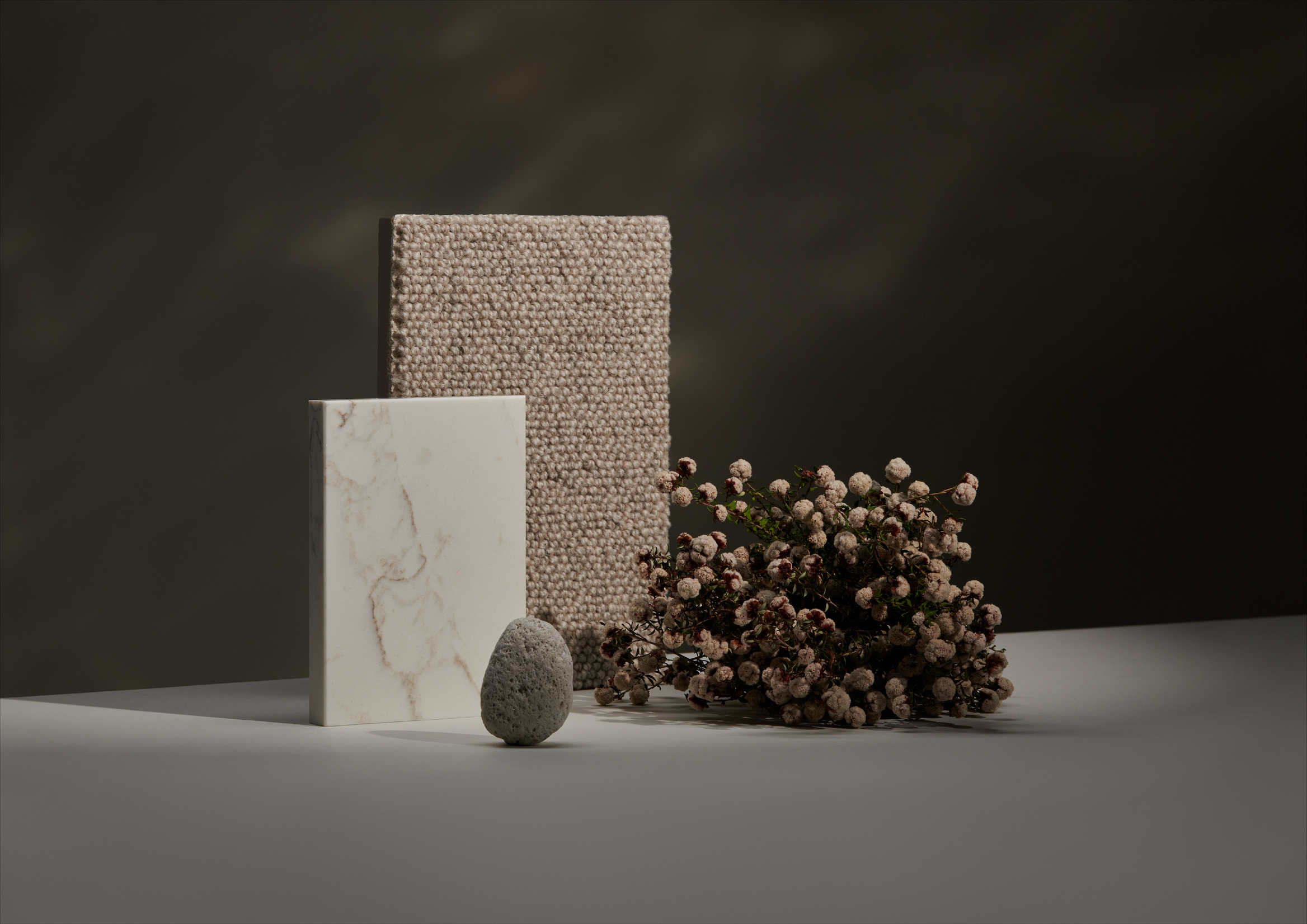
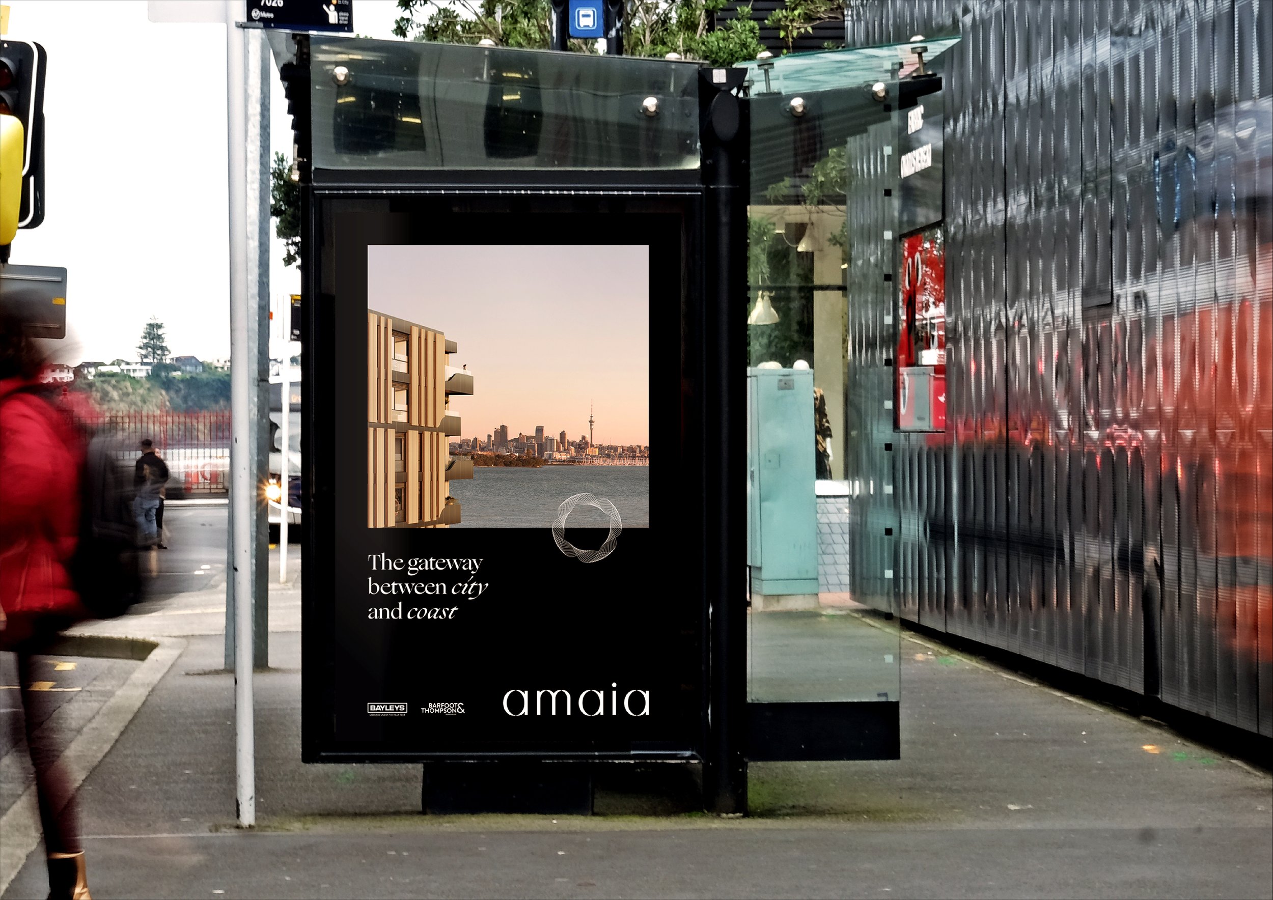
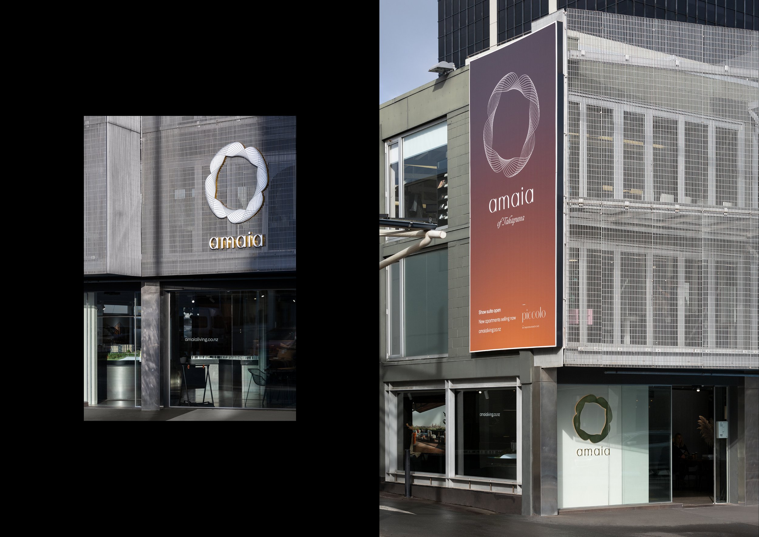
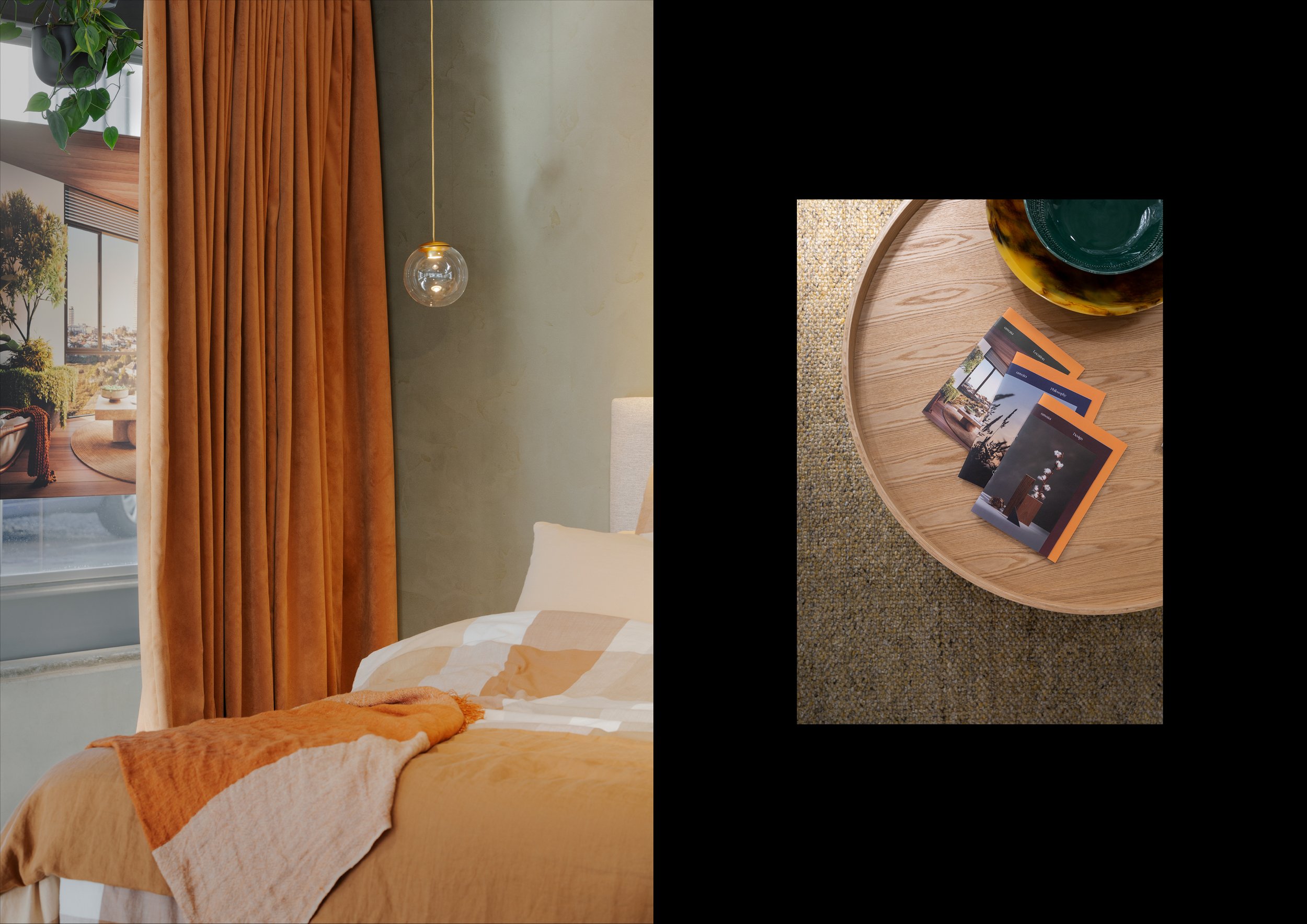
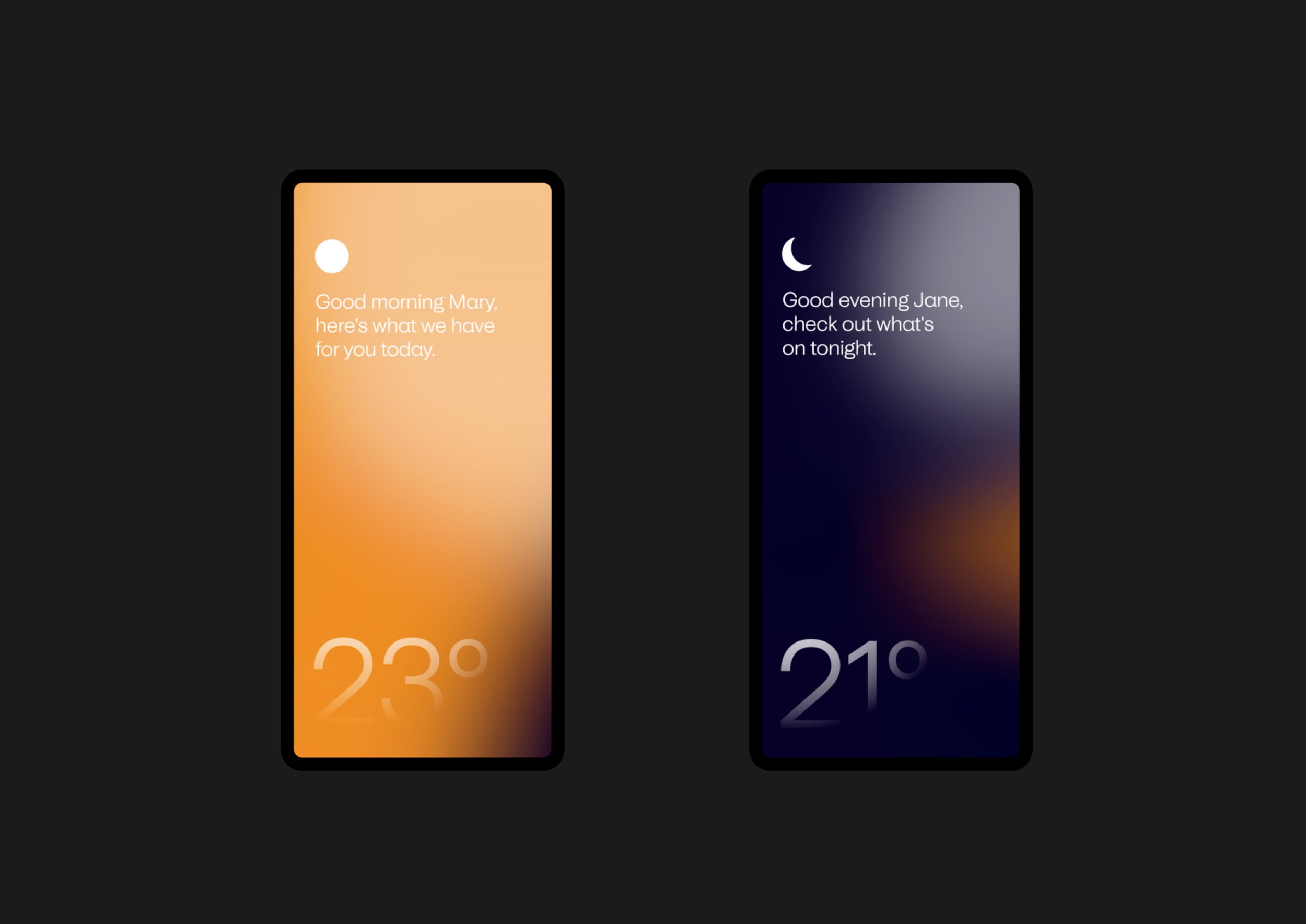


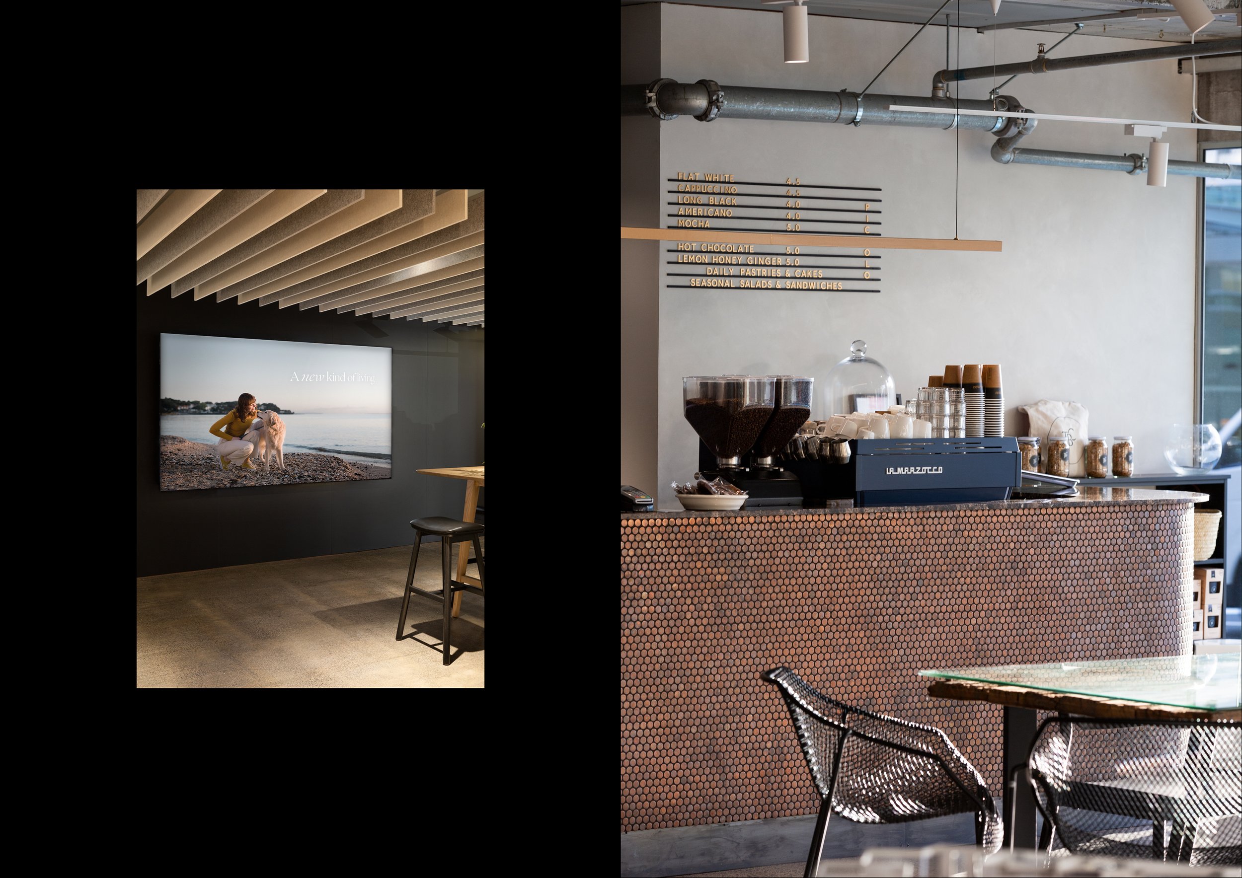
The design of Amaia, like the location of the development itself, plays in the space between city and coast. It’s an urban village with the ocean at its doorstep. With the understanding that our primary target audience — young professionals living and working in the city — would be leaving their homes in the early morning and returning at dusk, we developed a colour palette that would evoke the light at sunrise and sunset.
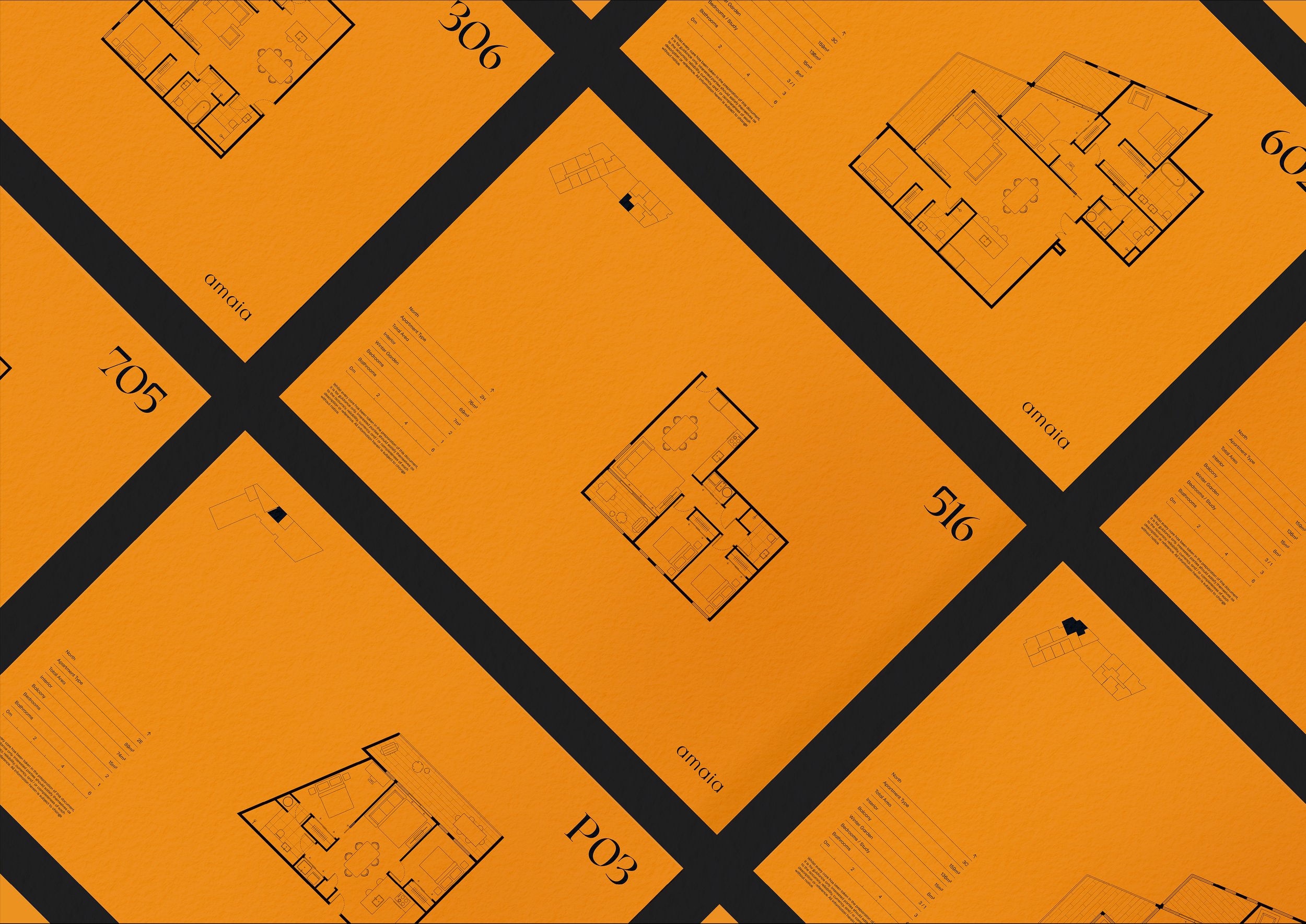
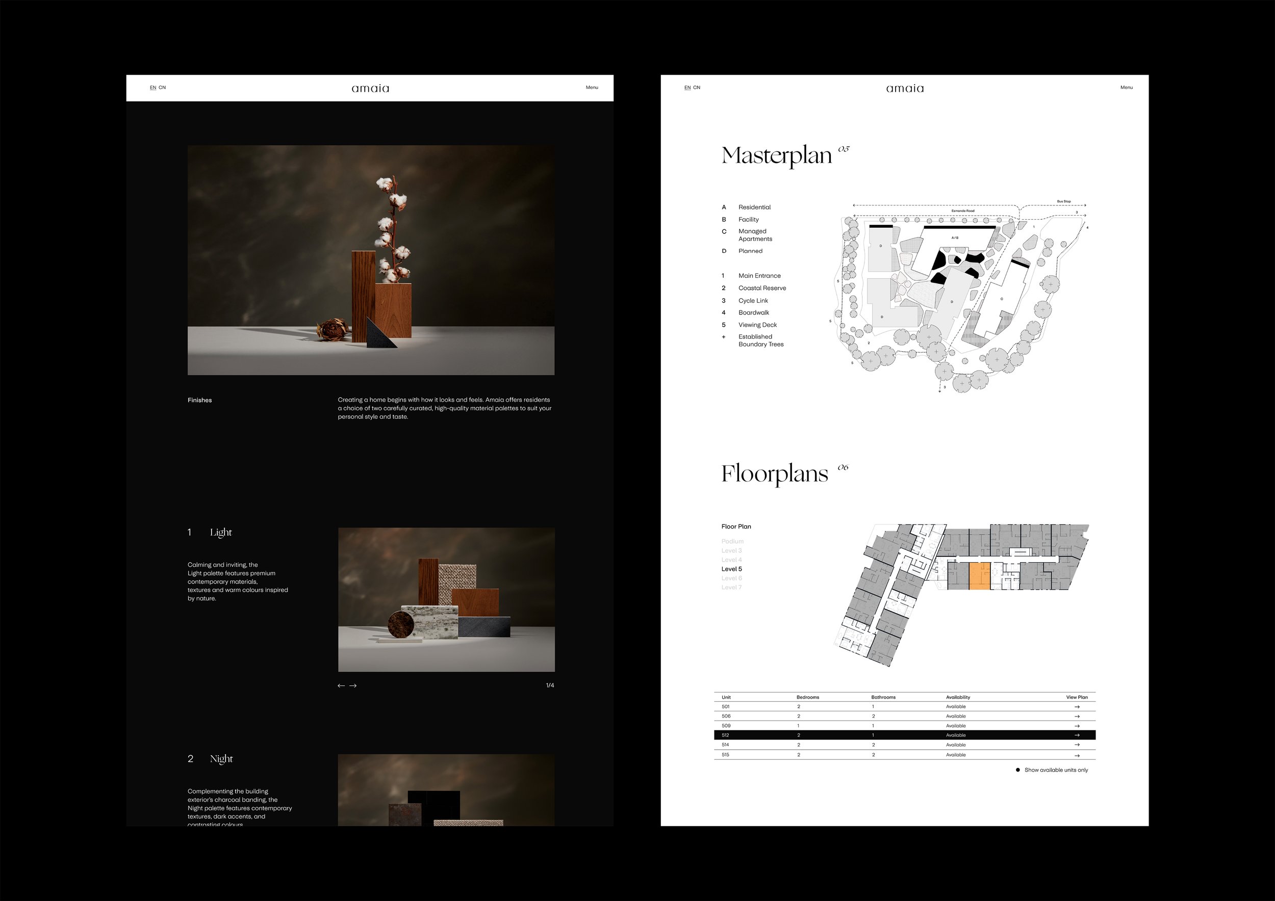
Universal Sans serves as the brand’s primary typeface; friendly and functional, it is a highly-legible sans serif that has been customised for Amaia to include rounded geometric features to echo the brand’s logo. Ogg is Amaia’s display typeface. The flowing, calligraphic characteristics of its letters bring an elegant warmth to the identity, and echo the script sign painting on the boats that line the harbour.
Finally, after being so closely-tied with both client and project, I wrote a poem that would encapsulate the feeling of home and this was used throughout collateral.
Amaia emphasises warmth, connection and the feeling of living in a very new type of urban neighbourhood.